Adding a second sidebar to your Blog - part 2
In one of my older posts, I gave a short tutorial on how to add a second sidebar to your Blog. Recently I got some comments of people who got stuck, so I decided to post a second, more detailed tutorial on how to rig up a second sidebar.
Understanding structure and layout.
First of all, you have to understand that your Blog Layout consists of several sections. The standard Blogger template has a Header-section, a Sidebar-section, a Main-section and a Footer-section. Inside these section Blogger puts the widgets, these are the page-elements that you can select from the Template-tab.
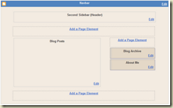
Now, let's take a look at the structure of a standard Blog. If you create a fresh, new Blog, the Page Elements Tab looks like this:
This Layout has 4 sections: Header, Main (with the Blog Posts), Sidebar and Footer.
The HTML-template looks like this (the line-numbers are added for reference only):
010: <body>
020: <div id='outer-wrapper'>l<div id='wrap2'>
030: <!-- skip links for text browsers -->
040: <span id='skiplinks' style='display:none;'>
050: <a href='#main'>skip to main </a>
060: <a href='#sidebar'>skip to sidebar</a>
070: </span>
080: <div id='header-wrapper'>
090: <b:section class='header' id='header' maxwidgets='1' showaddelement='no'>
100: <b:widget id='Header1' locked='true' title='Second Sidebar (Header)' type='Header'/>
110: </b:section>
120: </div>
130: <div id='content-wrapper'>
140: <div id='main-wrapper'>
150: <b:section class='main' id='main' showaddelement='no'>
160: <b:widget id='Blog1' locked='true' title='Blog Posts' type='Blog'/>
170: </b:section>
180: </div>
190: <div id='sidebar-wrapper'>
200: <b:section class='sidebar' id='sidebar' preferred='yes'>
210: <b:widget id='BlogArchive1' locked='false' title='Blog Archive' type='BlogArchive'/>
220: <b:widget id='Profile1' locked='false' title='About Me' type='Profile'/>
230: </b:section>
240: </div>
250: <!-- spacer for skins that want sidebar and main to be the same height-->
260: <div class='clear'> </div>
270: </div> <!-- end content-wrapper -->
280: <div id='footer-wrapper'>
290: <b:section class='footer' id='footer'/>
300: </div>
310: </div></div> <!-- end outer-wrapper -->
320: </body>
Lines 010 and 320 are the body-tags. All your code has to be between these two tags.
Lines 020 and 310 are the div-tags for two wrappers, the wrapper called "outer-wrapper" and the wrapper called "wrap2". In CSS you can define fonts, colors, and other styling for these wrappers. We'll look into CSS later in this tutorial.
Lines 080 to 120 contain the header. As you see, there is a div-wrapper (080 and 120), section-tags (090 and 110) and the widget that contains the header itself (100).
Lines 130 to 270 contain the content. Content means here: blog posts and sidebar. There is a div-wrapper called "content-wrapper" (130 and 270), and inside this wrapper there are 2 more wrappers: the "main-wrapper" (140-180) and the "sidebar-wrapper" (190-240).
Inside the main-wrapper we find the main-section (150 and 170) with the Blog-widget (160). This widget contains your posts.
Inside the sidebar-wrapper we find the sidebar-section (200 and 230) with an Archive-widget (210) and a Profile-widget (220).
And finally we have a Footer (280-300).
Now that we understand the structure, let's take a look at the formatting of this template. In the stylesheet you will fund the following code:
#outer-wrapper {
width: 660px;
padding: 10px;
....... }
#main-wrapper {
width: 410px;
float: left;
....... }
#sidebar-wrapper {
width: 220px;
float: right;
........ }
The outer-wrapper has a width of 660 pixels. The padding is set to 10 pixels, so that everything that is inside the outer-wrapper stays 10 pixels from the border. So that leaves 660 - 20 = 640 pixels for main-wrapper and sidebar-wrapper.
The main-wrapper has a width of 410 pixels, and floats to the left.
The sidebar-wrapper had a width of 220 pixels, and floats to the right. Together, main-wrapper and sidebar-wrapper have a width of 410 + 220 = 630 pixels. In the middle there is a space of 640 - 630 = 10 pixels.
So, if we want to squeeze in a second sidebar, we have to do something to create space. As it is now, it won't fit in.
Adding a second sidebar.
First, we will add the sidebar to the structure of the template, then we will add it to the CSS, and make it fit into the page.
Step 1: Backup the template.
Step 2: Make your right-sidebar unique.
Change lines 190 and 200:
190: <div id='right-sidebar-wrapper'>
200: <b:section class='sidebar' id='right-sidebar' preferred='yes'>
In your CSS style-sheet, change "#sidebar-wrapper" to "#right-sidebar-wrapper".
If you save your template now and view your blog, it should look okay.
Step 3: Add a left sidebar by adding new lines of code:
131: <div id='left-sidebar-wrapper'>
132: <b:section class='sidebar' id='left-sidebar' preferred='yes'/>
133: </div>
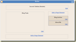
Now save your template, and take a look at the Page Elements tab.

You can see there is a new section, just below the header and above the posts. But it is not at the left side of the screen jet. Therefore, we have to add some CSS.
Step 4: Add CSS for the left sidebar.
In your CSS-style sheet, add the following code:
#left-sidebar-wrapper {
width: 220px;
float: left;
word-wrap: break-word;
overflow: hidden;
}
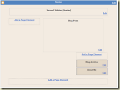
Your Page Layout tab will show something like this:
The sidebar-section is now to the left, but your right-sidebar is suddenly below your posts. That is because the width of 2 sidebars and a main-section counts up to 840 pixels, and that is more than the width of the outer-wrapper (660 pixels).
Step 5. Change outer-wrapper and header-wrapper width.
In your CSS-stylesheet look for the #header-wrapper and #outer-wrapper definitions, and change the width from 660 to 860.
Step 6. Add a page element.
Now finally, add a page element to your left sidebar.
Your Blog Layout will look like this now:


